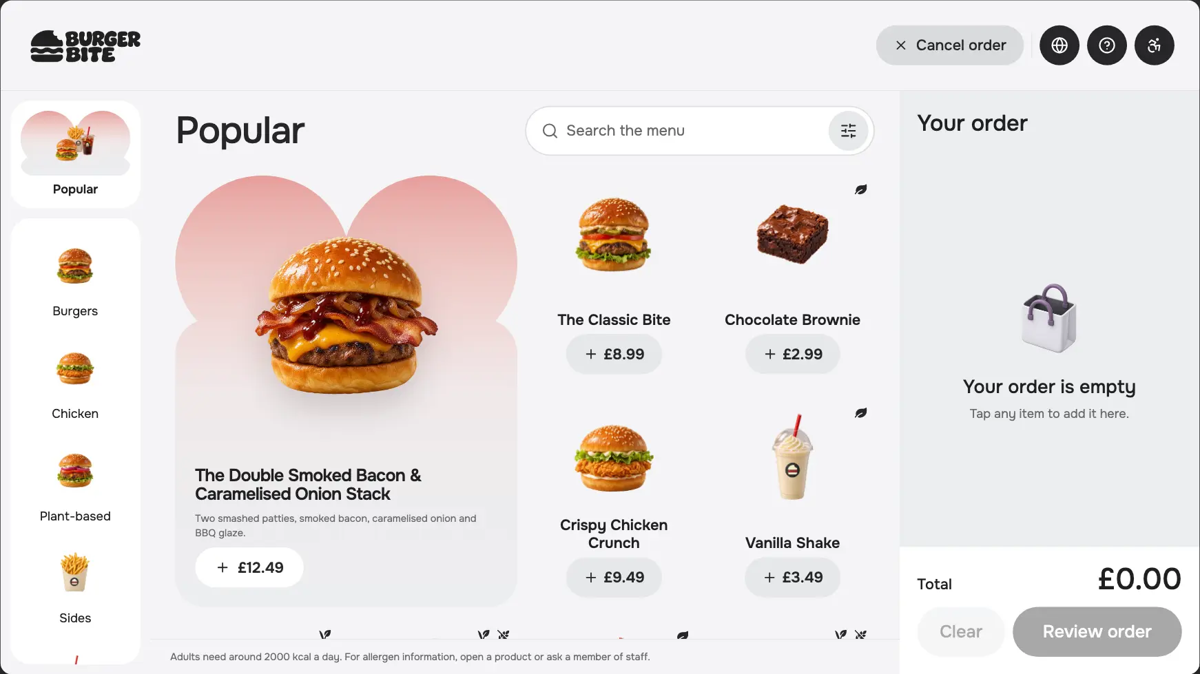
Tevalis — Web Kiosk UX/UI (work in progress)
Work in progress: exploring a clearer self-service kiosk journey through problem framing, design decisions, prototype iteration and an evolving accessibility approach. Customer, hardware and operational validation remain ahead.
I’m exploring how the Tevalis Web Kiosk can support a first-time customer from browsing and customisation through payment and collection—including situations that need staff help. Burger Bite is the demonstration brand. This case study records the current design thinking, the problems exposed through prototyping, and the questions still open.
My contribution spans problem framing, UX/UI direction, interaction logic, design-system application and prototype iteration. AI-assisted implementation and independent browser QA help make the ideas inspectable; they do not replace research with customers or testing on physical kiosks.
Current stage: Design and prototype iteration, with review materials prepared. Nine design flow groups across portrait, landscape and compact. Customer usability, accessibility and operational validation are still ahead.
Current prototype · seven journeys in 3:40
Chapters and design scope
| Starts | Journey | UX focus |
|---|---|---|
| 0:10 | Quick order and payment | Clear browsing, visible basket feedback and optional checkout steps |
| 0:53 | Customise a burger | Required choices, optional modifiers and changing price |
| 1:17 | Build a meal | Progressive steps and a final summary |
| 1:45 | Nutrition-only product | Useful information open by default |
| 2:03 | Basket edits, meal swap and Undo | Preserve choices and make changes reversible |
| 2:30 | ID check at the counter | Save the order, print a ticket and clearly communicate unpaid status |
| 3:00 | Staff ID approval at the kiosk | Approval unlocks payment; it does not mark the order paid |
The video demonstrates seven journeys. The wider design set covers nine flow groups: start; find products; customise; build a meal; review basket; pay; finish and receipts; help and restart; age verification. Alternate ID-check routes are separate examples.
Framing the problem before refining the screens
The starting point was an ongoing kiosk project with an early prototype, journey maps and a shared TevX design system. As the design developed, the working prototype fell behind the intended flows. That gap made it harder to judge whether a screen worked as part of a complete order.
The initial brief asked a practical question: can someone choose food, customise it, correct the basket, pay and understand collection without an explanation from staff? I broke that into decisions the interface must support:
-
Understand the task: distinguish required choices, optional offers and information.
-
Keep control: see the price, inspect selections and reverse a change without rebuilding the order.
-
Understand the outcome: know whether an order is saved, paid, waiting for staff or ready for the next step.
These are working design hypotheses, grounded in the brief, pattern review and prototype inspection. They are not findings from customer interviews or measured ordering sessions.
How the direction developed
| Working input | What it changed or established |
|---|---|
| Initial brief · 2026-11-04 | Set out eight journey topics, three reference formats, touch/readability considerations and recovery states. SumUp and Cuberto were visual/structural references, not evidence that our proposed interactions would be usable. |
| Age-verification extension · 2026-11-10 | Added an operational question: should the customer wait for staff at the kiosk or take an unpaid order to a staffed counter? The memo records two venue-configured routes. |
| Saved design handover · 2026-11-15 | Made the developing screen set, components and product logic available for review. The nine screen-flow groups use a different taxonomy from the original eight journey topics. |
| Prototype and QA iteration · 2026-11-16 | Exposed issues with preserved choices, compact layouts, action labels and status messages. The fixes and the nutrition refinement are demonstrated in the current prototype. |
The earlier study established the browse–choose–review structure. Later iterations refined the visual hierarchy, shared controls, product presentation and behaviour across formats. The current landscape menu above is the later prototype state. The comparison shows design evolution; it does not establish an improvement in task completion time.
Make the next decision obvious
A first-time customer needs to understand what is required, what is optional and how a choice changes the order. The product sheet distinguishes required selections from extras and removals. Its main action names a missing choice; the price updates as selections change.
Meal building carries that approach through burger, side and drink steps, followed by a summary before the meal is added. The working hypothesis is that smaller decisions reduce the amount a customer needs to hold in memory.
The trade-off is additional steps. A single long configuration surface exposes more choices at once; progressive steps provide focus but can slow repeat customers. The prototype lets us test whether people understand their progress, revisit an earlier choice and recognise when the meal is complete.
Let a simple product stay simple
Review raised a mismatch: a product with no modifiers was inheriting a configuration surface without useful choices. The iteration gives that space to allergens and available nutrition, opened automatically, while retaining quantity and the main action.
This applies progressive disclosure selectively. Hiding information can reduce clutter on a complex product, but adds an unnecessary step when there is nothing else to configure. The next usability check is whether customers notice and understand the information without mistaking illustrative nutrition or allergen data for venue-verified guidance.
The vanilla shake demonstrates this refinement from an existing basket item. It is an extras product in the prototype, so the video does not imply that it has a normal menu tile. Catalogue and nutrition values are illustrative.
Use otherwise empty configuration space for information that helps the customer decide.
Configurable products retain their information toggle. Products without choices open the information panel by default. The layout follows the task instead of forcing every item into the same interaction.
Offer a saving without changing the order
A meal-swap offer is only credible if “same food, lower price” preserves the customer’s choices. QA found that the earlier prototype could change a Medium Cola to Regular and lose “No ice”.
The corrected behaviour preserves eligible sizes and modifiers, keeps them editable and shows the saving before acceptance. Unsupported combinations do not receive the offer. Undo restores the original separate lines and selections.
The decision was to restrict eligibility rather than offer a saving that silently changes the food. This trades the frequency of the offer for fidelity to the customer’s intent. The remaining question is whether the offer and Undo are noticeable and understandable in a real ordering session.
Separate ID approval, order saving and payment
Age-restricted orders introduce three different events: a staff decision, a saved order and a completed payment. Each needs its own message and next action.
The research memo records a hospitality concern: a staff-attention slip at the POS may go unnoticed. That made staff availability part of the design problem. A counter handoff assumes an available, clearly signposted counter; an attended-kiosk route assumes reliable nearby staff response. The venue configures the supported route—the customer is not asked to choose the staffing model.
Pattern references helped separate basket transfer, staff authentication and an actual ID decision. Combining them into these Tevalis routes is a design proposal. The operational assumptions still need review with venue staff.
The product and basket explain the ID requirement early. The kiosk saves the demo order and prints a reference. The customer takes the ticket and ID to a team member, who checks ID and takes payment.
The kiosk requests help, shows acknowledgement and separates staff sign-in from the customer journey. Approval leads to payment methods. Editing a restricted order invalidates its earlier approval.
This is demonstrated interaction logic. Staff authentication, message delivery, printing, order persistence and card-reader behaviour are simulated.
Keep the behaviour consistent across three formats
The layouts were designed for portrait 1080 × 1920, landscape 1920 × 1080 and compact 1180 × 820. Shared semantic tokens, reusable controls, status patterns and artwork keep the visual language consistent; layout and hierarchy adapt to the space available.
The design challenge was more specific than shrinking a large screen. Compact status screens needed their own spacing, heading sizes and action arrangements so instructions and controls remained visible.
Accessibility approach · considerations, implementation and open checks
Accessibility shapes the core journey: understandable language, visible choices, reversible actions, readable information and a clear route to help. The current compact accessibility mode is one exploration within that approach; it does not establish that the kiosk is accessible.
| Consideration | Current approach and evidence | Still to validate |
|---|---|---|
| Reading and cognitive load | Explicit action labels, required/optional distinctions, progressive meal steps and summaries. The compact mode uses larger labels and a simpler product grid. | Comprehension with first-time customers, people with lower digital confidence and people who need more reading time; long labels and translated content. |
| Vision and status recognition | Semantic colour tokens support consistency. Important statuses pair wording with icons; the unpaid ticket is explicit. | Contrast across actual states, viewing distance, glare, magnification and text resizing. A token system alone is not evidence of adequate contrast. |
| Motor interaction and reach | Generous controls, persistent actions and state-specific compact layouts. The PIN error iteration restores visible access to both Sign in and Cancel. | Target spacing, accidental taps, dexterity needs and seated/standing reach on the intended screen and mount. Reference pixel dimensions are not physical reach measurements. |
| Motion | The prototype contains a reduced-motion CSS rule. | Behaviour with reduced-motion settings across the full journey, including transitions and progress feedback. |
| Keyboard and assistive technology | Some controls have accessible names; search results and basket feedback include live-region markup. | End-to-end keyboard operation, focus order, overlay focus management, screen-reader announcements and error association. These have not had a formal audit. |
| Time, recovery and assistance | Keep-order prompts, explicit cancellation, Undo and a help route aim to protect progress. The general inactivity warning currently begins after 60 seconds, with a 30-second countdown where applicable. | Whether those timings disadvantage slower readers or users needing assistance; options for more time; what help means when staff are unavailable. |
Current limits are visible in the prototype: the enlarged accessibility mode is implemented for compact; portrait and landscape currently show a “coming soon” message. Language controls currently report English only. These are unfinished areas, not completed accessibility or localisation support.
An important tension remains between clearing a shared kiosk for privacy and giving a customer enough time to finish. Likewise, fewer, larger product cards can improve legibility while increasing scrolling. Both decisions need evaluation on the intended hardware with people who have varied access needs.
Use prototype failures to revise the design
Review included the ordinary ordering path, failure states, long labels, large baskets and staff interactions. One compact PIN error state pushed Cancel below the visible area. The correction adjusted that expanded form’s geometry so the error and both actions fit together.
The independent QA record reports eight actionable findings fixed and rechecked, with 237 state/format captures and no page errors in that pass. The standalone extraction subsequently passed 39 tests across six files, a clean install/build and all seven browser journeys. Three matched menu captures had zero differing pixels between the original and extracted prototypes.
These are delivery and verification results. They do not establish improved conversion, faster ordering or customer usability outcomes. Physical kiosk testing, formal accessibility assessment and production integration remain separate work.
What the next iteration needs to answer
The next phase should test the design hypotheses, alongside the implementation checks already completed. This is a proposed validation plan, not research that has already taken place.
| Question | Proposed evaluation | Evidence to capture |
|---|---|---|
| Can a first-time customer order without prompting? | Observe browsing, customisation, meal building and checkout with representative customers, including people with varied access needs. | Completion, hesitation, wrong turns, assistance and the customer’s explanation of the total and next step. |
| Are edits and offers trustworthy? | Ask participants to change ingredients, accept a meal swap and reverse it. | Whether they notice what changes, whether choices remain correct and whether they can find Undo. |
| Are saved, approved and paid states distinguishable? | Review each ID route separately with customers and venue staff. | Interpretation of the ticket/status, understanding of the next action and staff response/retrieval feasibility. |
| Does the interface work on the real kiosk? | Test intended hardware, mounting, lighting and input conditions; review keyboard and screen-reader paths separately. | Reach, legibility, target accuracy, focus/announcement problems and time needed before timeout. |
The current outcome is a more complete, inspectable prototype and a record of resolved implementation problems. The open work is to validate the experience, refine incomplete accessibility and language support, confirm venue operations and integrate real services.
Working materials for continued review
The materials connect the current design thinking to observable behaviour: Figma for the visual system and flows, the brief and research memo for the reasoning, the local prototype for interaction review, and the narrated demo for a concise walkthrough. They are versioned review artifacts within an ongoing project.
The standalone prototype includes its own source, assets, lockfile, tests and setup instructions. It can be installed and built independently of the TevX monorepo. No remote repository or live kiosk deployment was created for this handover.
Problem framing, research notes and design materials
Initial design brief, age-verification research memo and attributed visual references · ZIP
The brief and memo are historical working documents. The first excludes age-restricted sales; the later memo extends the scope. Read their dates and assumptions alongside the newer prototype, rather than treating either as a final implementation specification.
Product logic and supporting flow documentation · PDF
Editable Pen handover snapshot · ZIP
Design artwork and fonts · assets 1 of 3
Design artwork and fonts · assets 2 of 3
Design artwork and fonts · assets 3 of 3
To open the Pen source: extract the source ZIP and all three asset ZIPs into the same folder, then open design/kiosk-handover.pen in pen.dev/Pencil. All 57 locally linked artwork/font files are included with their relative paths.
Version note: the saved Pen handover snapshot is from 15 November 2026. It is retained as delivered; the prototype and video demonstrate the subsequent QA fixes and default-open nutrition refinement. Treat those as distinct snapshots. The Figma migration audit also records partial component linking: some editable frames are detached rather than fully linked instances.
Run the standalone prototype
Standalone prototype source and assets · ZIP · source commit 9bf596f
After extracting, use Node.js 24 LTS and npm:
cd tevalis-kiosk-prototype
npm ci
npm run devOpen http://localhost:5193. Review controls switch layout and simulated scenarios. The card-reader artwork simulates payment; staff review uses demo PIN 1234.
Run npm run check for TypeScript, lint, tests and build. Run npm run build followed by npm start to serve the built app on port 3000.
README.md, SOURCE.md and VALIDATION.md document the setup, provenance and validation limits, including retained lint warnings and dependency advisories. This is local prototype code, not a production integration.
Demo, narration, captions and reproducible edit
The final 3:40 MP4 is embedded above and can be downloaded from its player.
Andi narration with the final viewing pauses · MP3
Separate SRT and VTT captions · ZIP
The production-assets archive preserves the delivered package except for the final MP4 and final narration, which are attached separately here. Save those two files into its product-demo-restart/ folder to reconstruct the full delivery package. The README describes dependencies and the original workspace paths used by the capture/edit scripts.
The narration uses Andi’s approved voice sample at normal speed, with added silent viewing time. The video uses real prototype captures, no music and separate example orders.
Validation and evidence
The broader QA pass and standalone extraction are separately scoped and dated in these reports. Capture coverage is not a claim of pixel-exact parity across every screen, and the simulated staff PIN is not production authentication.
No customer research sample, live conversion result or production rollout outcome is claimed in this case study.